

A comprehensive guide to data preparation and visualization

Barplots are an essential and widely used visualization tool for several reasons. They are excellent choices for visualizing the relationship between numeric and categorical variables, making it easy to understand the differences between categories or groups. They can represent counts, frequencies, proportions, and percentages, making them versatile for various data types.
In R, we have the ability to analyze categorical data and represent it through barplots. Nevertheless, beginners venturing into R programming often encounter challenges when it comes to estimating means, standard errors, and creating grouped barplots with error bars. To counter these challenges one must have a basic understanding of data types, data structures, and the operations required for data analysis.
In this tutorial, we start by creating a simple dataset to understand different kinds of data types and how to convert them into suitable formats for data analysis. Then, we will delve into the process of estimating means and standard errors. Subsequently, we will proceed to create a grouped barplot with error bars. To assist beginners, I will meticulously dissect the code, step by step, to ensure a thorough understanding of the programming process.
I assume our readers are familiar with the process of installing and loading R packages. If not, please refer to STHDAfor guidance.
Let’s jump right into creating the dataset, modifying it, and visualizing it. Begin by loading the necessary libraries as demonstrated below.
library(tidyverse)
library(ggthemes)
library(ggpubr)
The tidyverse is a core collection of R packages, which includes dplyr for data manipulation and analysis, andggplot2 for data visualization. The ggthemesprovides alternative themes and theme components to style ggplot2 plots. The ggpubr offers ggsave()to save plots with customizable dimensions, resolution, and file formats. To explore these packages further, simply click on the hyperlinks provided.
Creating a Dataframe:
In the code below data.frame() function initiates a dataframe named df with three columns: Animals, Category, and Counts.
df <- data.frame(Animals = c("cats", "dogs", "cows",
"cats", "dogs", "cows",
"cats", "dogs", "cows",
"cats", "dogs", "cows"),
Category = c("Domestic", "Domestic", "Domestic",
"Domestic","Domestic","Domestic",
"Stray", "Stray", "Stray",
"Stray", "Stray", "Stray"),
Counts = c("28", "22", "45",
"30", "18", "43",
"40", "65","10",
"35", "72", "8"))
💡 Alternatively create the dataframe in Excel and import the file to R.
Let’s view the dataframe dfusing view() function.
view(df)
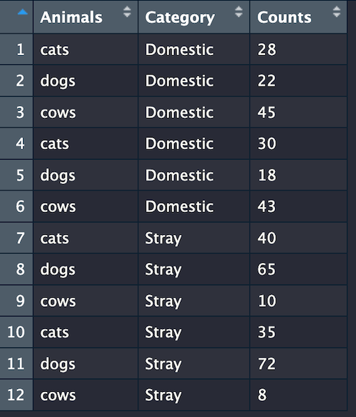
The Animalscolumn contains names of different kinds of animals. There are three unique animals in this column: “cats”, “dogs”, and “cows”. We sampled each kind of animal four times, resulting in a total of 12 rows. The Categorycolumn classifies the animals as either “Domestic” or “Stray”. There are six “Domestic” and six “Strays”. The Counts column represents the counts of each animal in the given ‘Category’ and ‘Animals’ columns.
Data types and data manipulation
In R, it’s crucial to understand the data typeof the columns (variables) in the dataframe, because different operations and functions may be applied to different kinds of data types. In the df dataframe, Animals andCategory columns have a Character data type and the Counts column has a numeric data type. Character data types are essential for working with text data, such as names, labels, descriptions, and textual information. Numeric data types represent numeric values, including integers and real numbers (floating-point values).
Let's get the summary of the dataframe using glimpse() function to know the data type of the variables in the dataframe df.
glimpse(df)
Rows: 12
Columns: 3
$ Animals  <chr> "cats", "dogs", "cows", "cats", "dogs", "cows", "cats", "dogs", "cows", "…
$ Category <chr> "Domestic", "Domestic", "Domestic", "Domestic", "Domestic", "Domestic", "…
$ Counts  <chr> "28", "22", "45", "30", "18", "43", "40", "65", "10", "35", "72", "8"
We can observe that the df dataframe consists of 12 rows (observations), and 3 columns (variables). Notably, the Animals and Category variables are identified as character data type, denoted as <chr>. The values within these variables are enclosed in double quotes, rendering them as character strings. However, an interesting observation is that the Counts variable is also identified as character data type. This may seem unexpected since the values within this variable are, in fact, numerical, not character strings. This misclassification of data types could potentially lead to complications when conducting numerical operations. To address this issue and facilitate numerical operations, we must take the necessary step of converting the Counts variable into a numeric data type.
You may have noticed that when I initially created the dataframe df, I intentionally enclosed the numeric values in double quotes, rendering the Counts variable as a character data type. Now that we have a clear understanding of the dataframe’s structure, let’s move forward and resolve this issue. We will do so by converting the Counts variable within the df dataframe from its current character data type to a numeric data type.
df$Counts <- as.numeric(df$Counts)
df$Counts selects the Counts column in the df data frame.
as.numeric() converts the input to a numeric data type.
glimpse(df)
Rows: 12
Columns: 3
$ Animals  <chr> "cats", "dogs", "cows", "cats", "dogs", "cows", "cats", "dogs", "cows", "…
$ Category <chr> "Domestic", "Domestic", "Domestic", "Domestic", "Domestic", "Domestic", "…
$ Counts  <dbl> 28, 22, 45, 30, 18, 43, 40, 65, 10, 35, 72, 8
Now the Counts variable is identified as numeric data type, denoted by <dbl> , often referred to simply as a “double”. The values within this variable are not enclosed in quotes indicating they are numerical, not character strings.
<dbl> stands for a "double-precision floating-point number. It is a numerical data type used to store real numbers and perform arithmetic operations on real numbers, including decimals.
Estimating mean and standard error
The code below creates a new dataframe named mean_df by performing data summarization and aggregation on an existing dataframe df.
mean_df <- df %>%
group_by(Animals, Category) %>%
summarise(mean= mean(Counts),
se = sd(Counts)/sqrt(n()))
Let’s break down the code step by step:
- The pipe (%>%) operator takes the existing dataframe df and passes it to the next part of the code. It sets df as the input for subsequent operations. In R, the %>% operator takes the result of one function on the left and passes it as the first argument to the next function on the right, allowing us to chain together a series of operations in a clear and sequential manner.
- The group_by() function groups the dataframe by the Animals and Category columns, creating subgroups within the dataframe based on the unique combinations of these two variables.
- The summarise() function estimates the mean and standard error and assigns them to new variables :mean and se respectively.
- The mean() function computes the mean (average) of the Counts column for each subgroup created by the group_by() operation.
- The sd() function calculates the standard error (se) of the Counts column for each subgroup. The standard error is calculated by dividing the standard deviation (sd()) of the Counts column by the square root of the sample size (sqrt(n())).
Let’s take a look at the summary of the data frame mean_df
glimpse(mean_df)
Rows: 6
Columns: 4
$ Animals  <chr> "cats", "cats", "cows", "cows", "dogs", "dogs"
$ Category <chr> "Domestic", "Stray", "Domestic", "Stray", "Domestic", "Stray"
$ mean     <dbl> 29.0, 37.5, 44.0, 9.0, 20.0, 68.5
$ se       <dbl> 1.0, 2.5, 1.0, 1.0, 2.0, 3.5
All set! we now have four columns or variables, including two new variables, mean and se calculated for the Counts column based on our grouping criteria. Let’s proceed with data visualization using this new dataframe, “mean_df.”
Visualizing the data
The code below takes a data frame mean_df and passes it to ggplot2 using %>% operator to create a grouped bar chart.
barplot <- mean_df %>%
ggplot(
aes(x = Animals, y = mean, fill = Category))+
geom_col( position = "dodge", width = 0.5, alpha = 0.5, color = "black", size = 0.1)
💡Note that the pipe (%>%) operator can be used in data manipulation and analysis to pipe multiple operations together but cannot be used in the data visualization process to add additional layers within the ggplot2 function. Instead, we use the ‘+’ symbol as shown above.
Let’s break down the code step by step:
- The aes() function, short for ‘aesthetic’ is to specify how the variables in the dataset are mapped to visual aesthetics in the plot. In this case, it specifies that the x-axis should represent the Animals variable, the y-axis should represent the mean variable, and fill bar colors based on the Category variable.
- The geom_col() calculates the height of each bar based on the values in the mean column. Here is the breakdown of the parameters used in the geom_col() function:
- position = "dodge": It specifies that the bars should be grouped side by side (dodged) based on the Category variable. This is what creates a grouped bar chart.
- width = 0.5: It determines the width of the bars. In this case, the bars have a width of 0.5.
- alpha = 0.5: It controls the transparency of the bars. An alpha value of 0.5 makes the bars somewhat transparent.
- color = "black": It sets the border color of the bars to black.
- size = 0.1: It specifies the size of the border around the bars. In this case, the borders will be relatively thin.
The combination of these parameters customizes the appearance of the bars in the barplot, making them thinner, somewhat transparent, with black borders, and arranged side by side for different categories, which can enhance the visual representation of the data.
Let’s look at the plot:
plot(barplot)
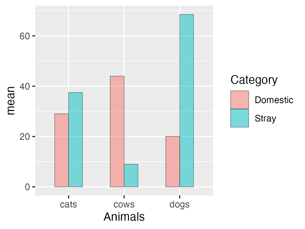
Great! We’ve successfully created a barplot, but the bars currently lack standard errors. Let’s incorporate standard errors into the plot.
Adding standard errors to the bars and customizing bar colors
First copy and paste the above code and then add geom_errorbar() function to it as shown below.
barplot <- mean_df %>%
ggplot(aes(x = Animals, y = mean, fill = Category))+
geom_col( position = "dodge", width = 0.5, alpha = 0.7, color = "black", size = 0.1)+
geom_errorbar(aes(ymin = mean-se, ymax = mean+se),
position =  position_dodge(width = 0.5), width = 0.2)
Let’s break down the components used in the geom_errorbar() function:
- yminand ymax defines the lower and upper values of the error bars based on the calculated mean and standard error.
- position argument is set to position_dodge() for placing error bars side by side (dodged) and width = 0.5to set the dodge width. Play around with the width parameter to notice the changes in the bar position.
- width = 0.2sets the width of the error bars. In this case, the error bars will have a width of 0.2
Let's look at the plot:
plot(barplot)
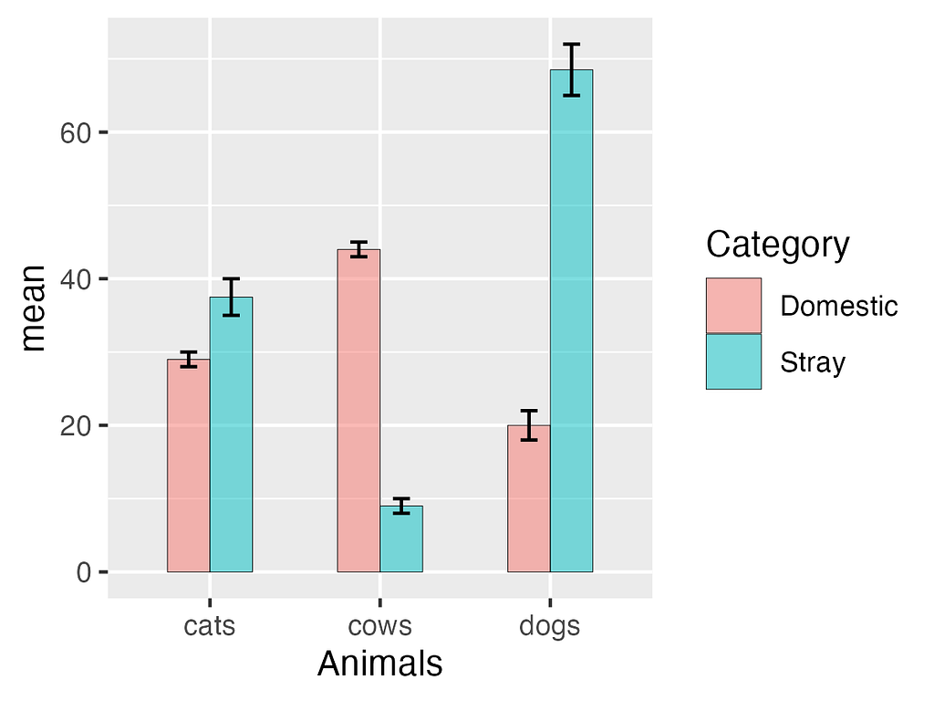
Great!. We now created a grouped bar chart with errorbars. This graph is nearly publication-ready, but a few minor adjustments can greatly enhance its appearance. For instance, you may have noticed a gap between the bars and the x-axis labels. Let’s remove it. Additionally, changing the bar colors, placing the figure legend inside the graph, and providing a predefined theme for clean and simple visuals will improve its overall presentation.
Creating publication-quality graph
Let’s start by copying the above code and then adding additional layers to it as shown below.
barplot <- mean_df %>%
ggplot(aes(x = Animals, y = mean, fill = Category))+
geom_col( position = "dodge", width = 0.5, alpha = 0.7, color = "black", size = 0.1)+
geom_errorbar(aes(ymin = mean-se, ymax = mean+se),
position =  position_dodge(width = 0.5), width = 0.2)+
scale_y_continuous(expand = expansion(0),
limits = c(0,100))+
scale_fill_manual(values = c("blue", "gray"),
name = NULL)+ # NULL removes the legend title "Category".
theme_par()+
theme(legend.position = c(0.2, 0.80))
Let's break down the code step by step
- The expand argument of scale_y_continuous() is set to expansion(0) to remove any padding around the y-axis limits, and the limits argument is set to c(0, 100) to set the y-axis limits from 0 to 100.
- The scale_fill_manual(values) is used to customize the legend for the fill aesthetic (colors of the bars) and to set the legend title to NULL, to remove the legend title “Category”
- The theme_par() is used to customize the theme for the plot, which provides a clean white background and compact graphics. It has its own pros and cons.
- The legend.position argument theme() was set to c(0.2, 0.80) to specify the position of the legend within the plot. Play with these values to understand this argument better.
💡 The predefined themes such as theme_par() will override theme components applied afterward. We have added theme(legend.position) after the theme_par() function to address this issue.
Let's look at the plot:
plot(barplot)
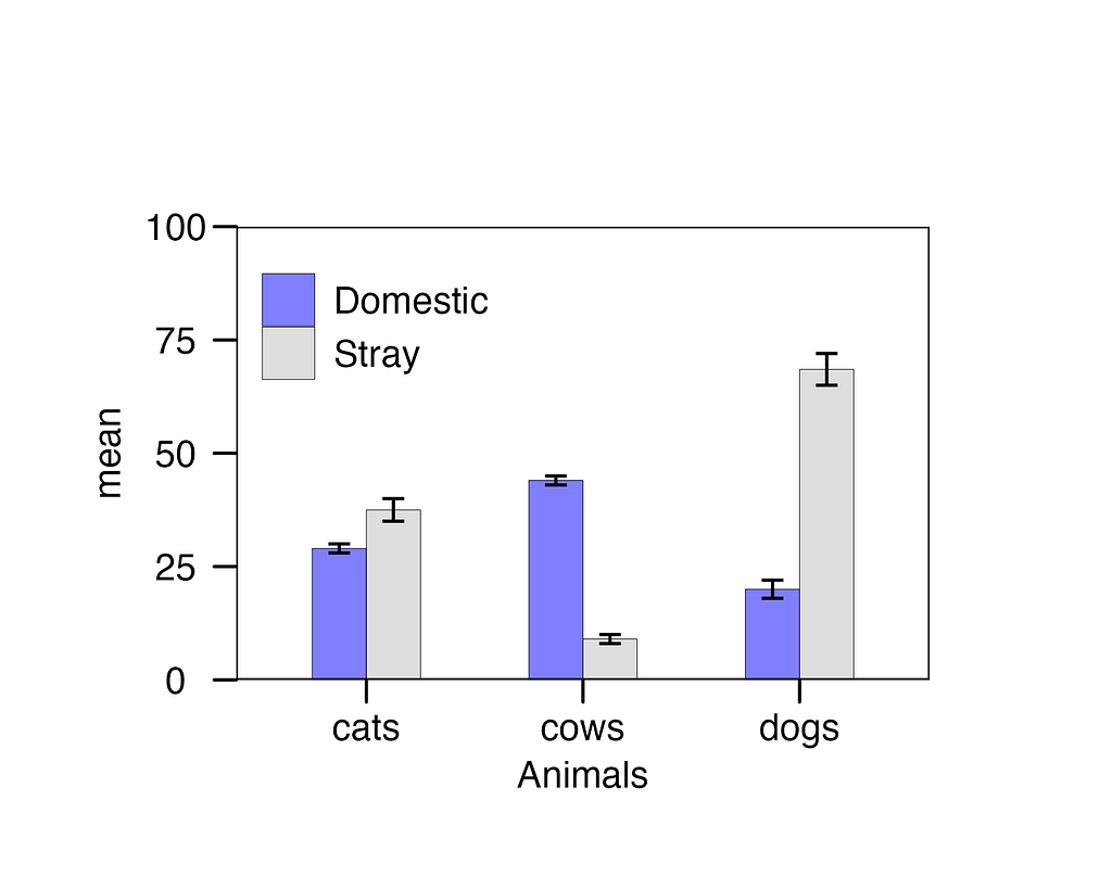
Here is a visually appealing and publication-ready bar chart with error bars. The graph effectively illustrates the variations in animal populations. In the ‘Stray’ category, dogs outnumber cats and cows, while in the ‘Domestic’ category, cows clearly outnumber cats and dogs.
Saving plot for publication
The code below utilizes the ggsave() function from the ggpubr library. To save the plot, we should specify the ggplot object bar_chart and then designate the filename with the desired graphic format. In this example, I have used the filename ‘barchart_animals.tiff’, which will save the chart as a TIFF image. I also set the dimensions in inches for ‘width’ and ‘height’ as well as the ‘dpi’ (dots per inch) for the resolution.
ggsave(bar_chart, filename = "barchart_animals.tiff", width = 5, height = 4, dpi = 300)
Now you’re all set to create publication-ready bar charts with standard error bars. Enjoy the creative process and have a blast plotting your data! 🎉✨
Grouped Barplot With Error Bars in R was originally published in Towards Data Science on Medium, where people are continuing the conversation by highlighting and responding to this story.